New Website & Branding Brings a New Competitive Edge for Caseware
Project & Background
Caseware provides accounting software solutions for firms, corporations, and government agencies. They hired our team to plan, design, develop, and launch a new website to showcase their tools, highlight resources, and reinforce their industry reputation. My primary focus was creating the sitemap and navigational structure, which this case study highlights.
Project Goals
Give Caseware a cohesive brand strategy and resources, and a new website to give them a competitive edge in their industry
Scope
This project included a full rebrand and website redesign, taking ~6 months to complete
My Role
I worked with a team of designers on this one, and my focus was on site structure and navigation for the website redesign
Challenges
Building for complex navigation requirements
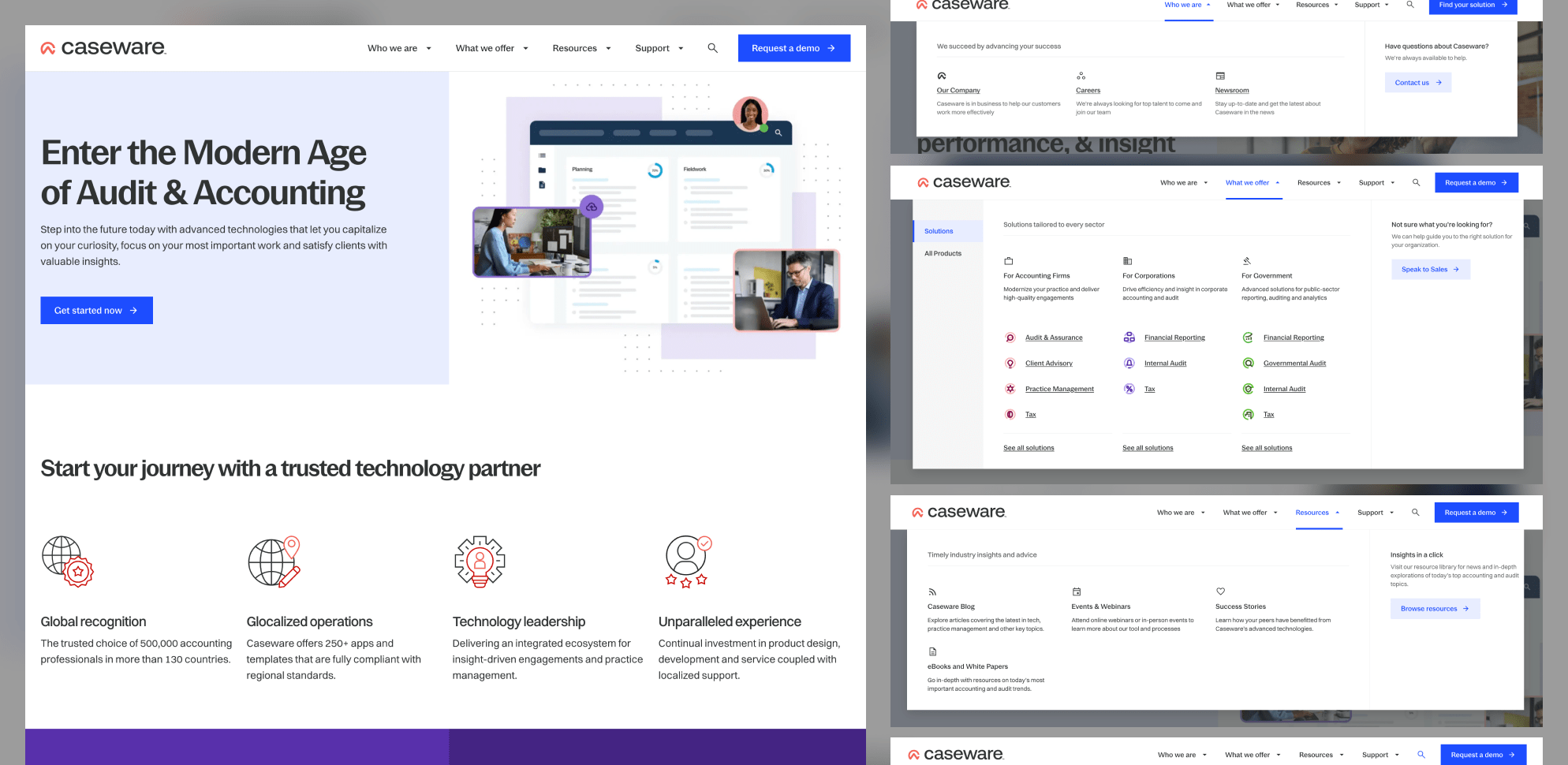
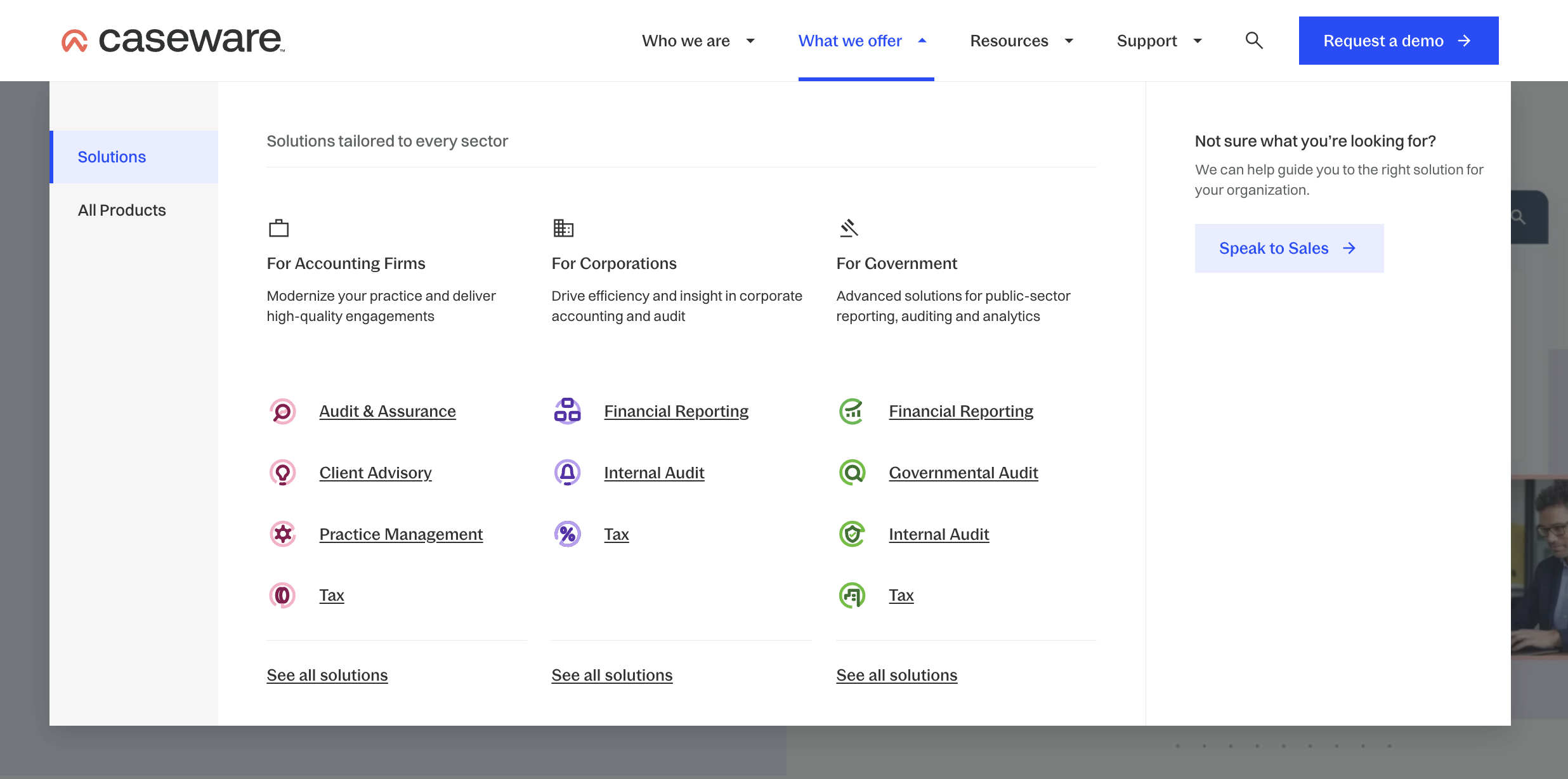
The main challenge in structuring the site and navigation was the extensive range of solutions Caseware offers. They wanted all solutions prominently displayed in the main navigation, categorized by sector. This included individual solutions, sector pages, and a comprehensive list of products, which are distinct from solutions. Additionally, each menu needed an impactful call-to-action (CTA) to support the website's primary goal of lead generation.

The finalized sitemap. Everything here needed to be accessible via the site navigation.
There were several considerations I had to take into account when I began exploring ideas for this layout:
👉 Not every menu item will have the same level of complexity
👉 The "What we Offer" tab will have to house a full product list plus groupings for different services
👉 Somehow, each menu item needs to be balanced visually
Collaborating closely with stakeholders, I developed wireframes and prototypes with several options for layouts. I kept the focus on simplifying the navigation structure while ensuring critical content remained easily accessible.
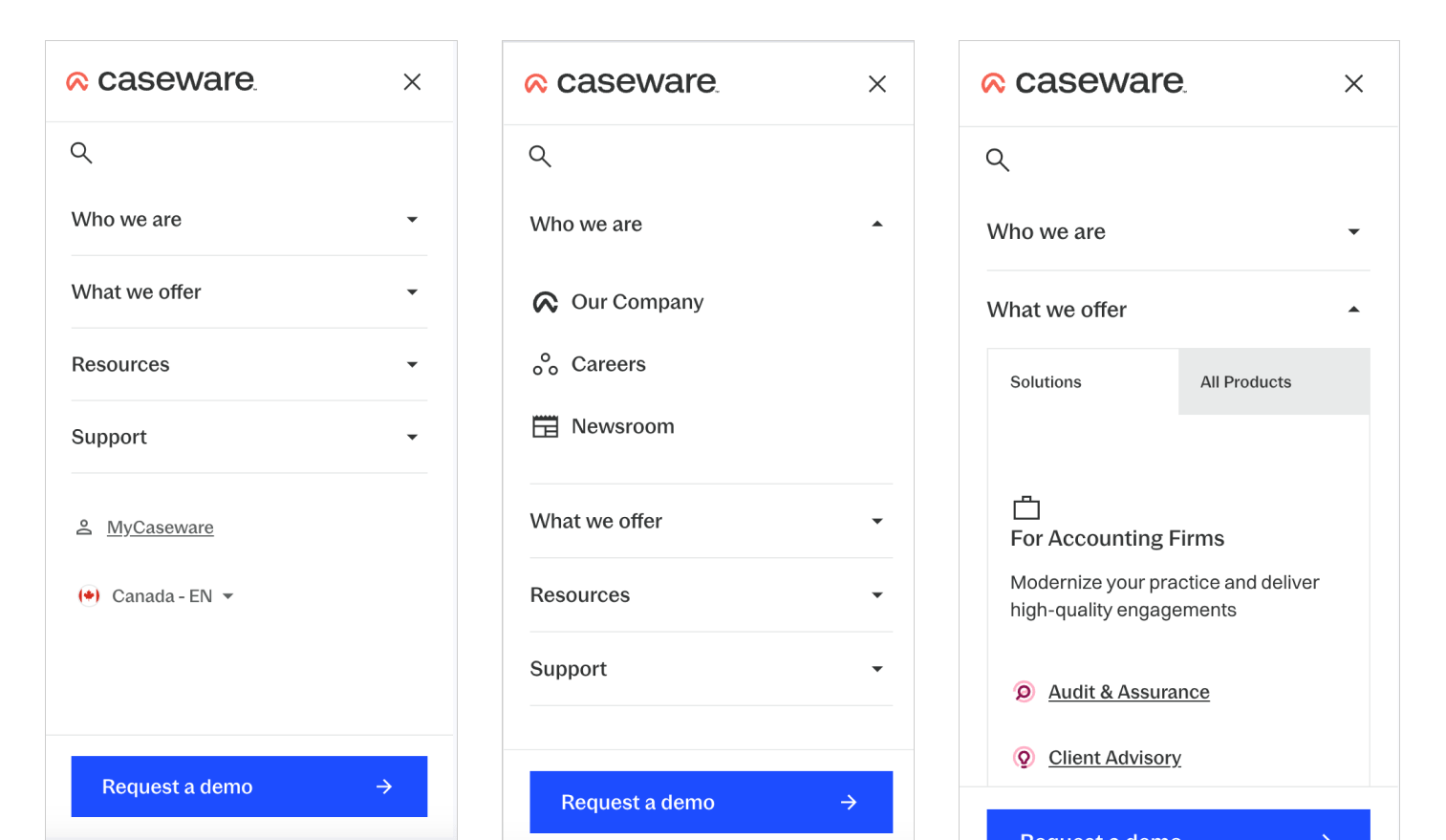
Once the wireframes were approved I moved on to designing for mobile, which, with complex navigation was another challenge.
Final Designs
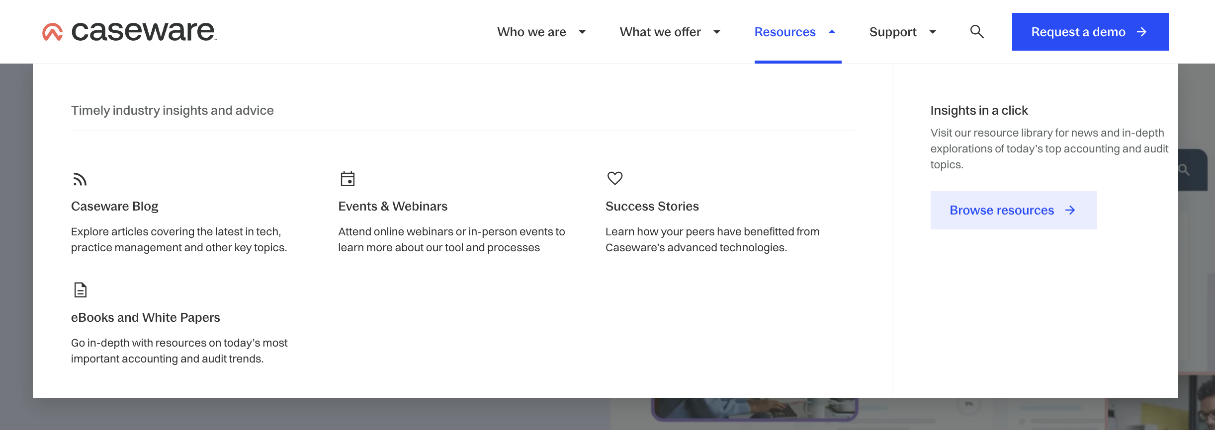
Main Navigation
Through several iterations and analyses of complex navigation systems, we finalized a design featuring a 3:1 horizontal section layout (reversed vertically for mobile). This layout allowed each page to be listed with contextual content under each link. Each menu item included a heading to enhance clarity.
To ensure the interactions were clear, we used a blue from Caseware’s brand guide to highlight links when hovered over. An added arrow provided visual indication of interactivity, suggesting forward movement.
Adjustments for mobile included removing the content written for each link, and fixing a CTA at the bottom of the mobile menu, instead of having one inside each section. I added tabs to their What we Offer section to separate their products from their offered 'solutions'.

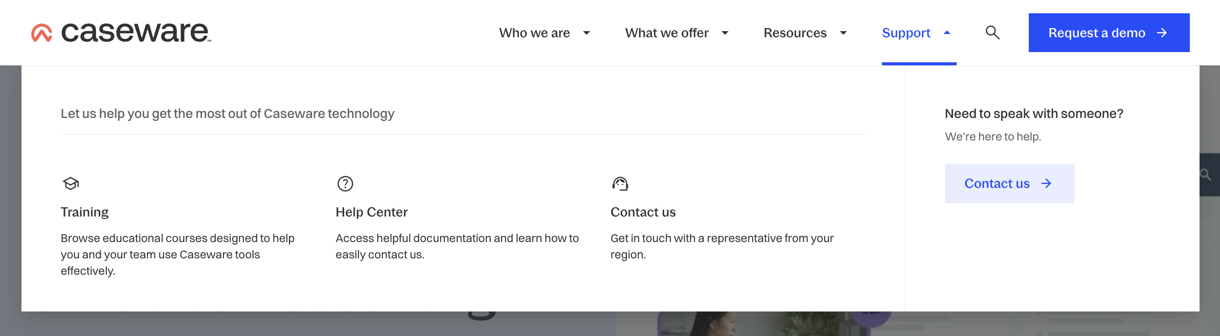
Site Search
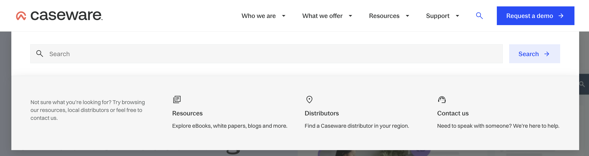
Another important component of the main site navigation was the search button. Since there is a complex product offering plus a blog and various resources on the site, we wanted users who were looking for something specific to be able to find it easily. I added a section below the search bar that has quick links to further help in case the user isn't sure what to search, or doesn't know where to start. These include links to resources, the distributors list, or contact information.
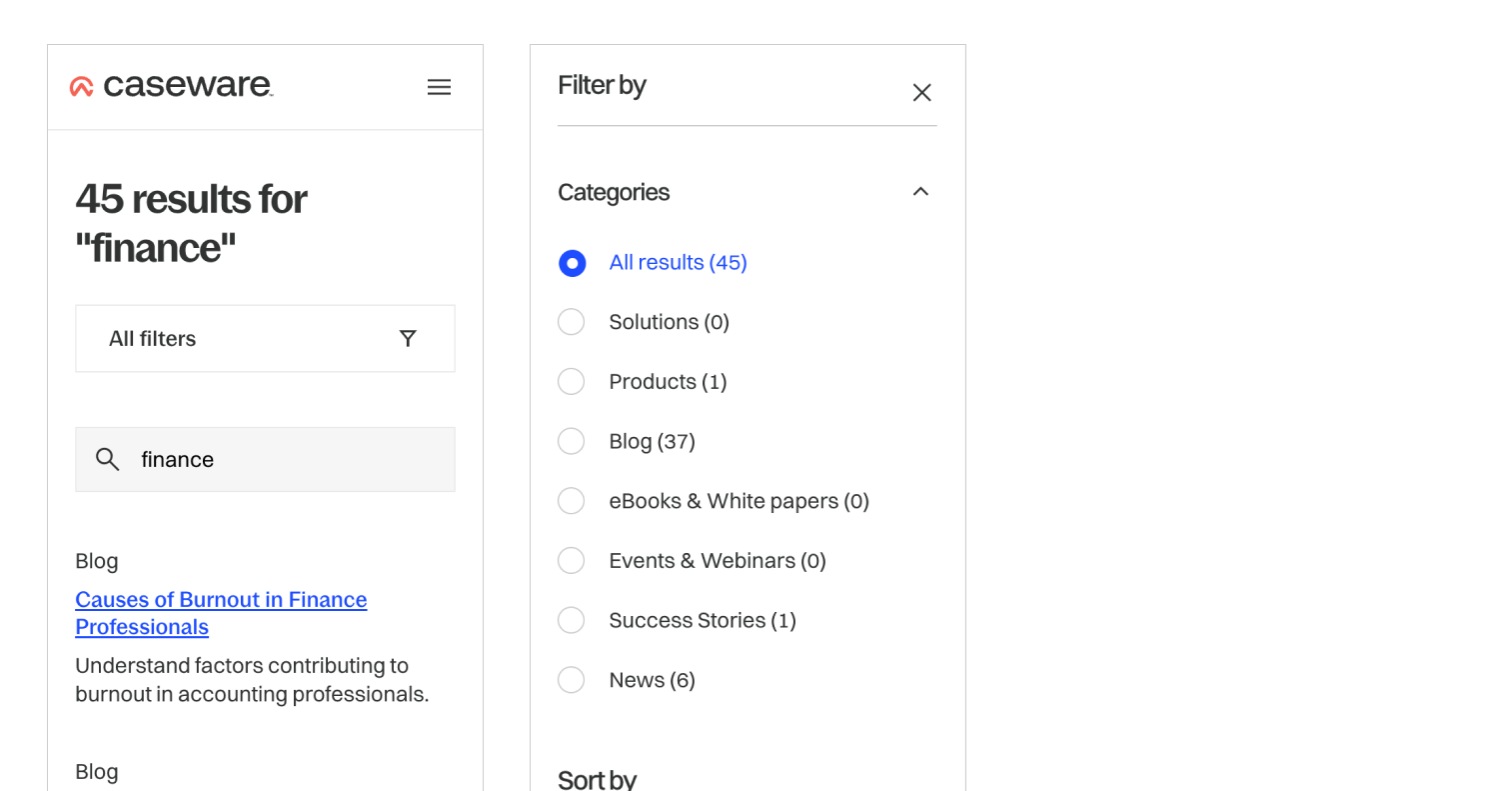
On the search results page, I designed each result with a tag for the type of content it is (ex. news article, blog, etc.). I also put in filters to help narrow down results on the left side. This section is fixed so you can always access it while scrolling down the page.

See it Live!
This project was completed mid-2023 and is live on the Caseware website.
Check it out
Read More Case Studies
Design Strategy Overhaul: Record-Breaking Leads from Market Research