Building Trust to Reduce Churn in a New Service Cancellation Flow
Cancellation flow relies on our ROI guarantee as a retention tool, and it is not working.
As it stands, AutoVerify's cancel flow is not clear, missing information, and heavily focused on pushing an ROI guarantee as a retention tool. It is not performing well, with no interest in the guarantee at all. Cancels are increasing and we need to assess what customers need and build a new flow to suit them, while also striking a balance in the needs of the CS and Sales departments.
AutoVerify is a SaaS startup that offers tools to help with the car buying process. This includes tools for car buyers tohelp them make informed decisions, and tools for car dealers to make the selling process easier.
Project Goals
Improve user experience through language and design updates, make life easier for the CS team, and, best case scenario, save some accounts.
Scope
Initially set to launch April 30, 2022 with a month-long timeline, but sidelined due to higher priority projects taking up resources. New launch date TBD.
My Role
Lead for design, research, and build. Collaborated with CS, Marketing, and our Growth Specialist for content, hierarchy, and flows.
Understanding the Problem
To keep the ROI guarantee, or not to keep the ROI guarantee...
This project was originally brought to me with the simple ask that I add a new product into the cancel list. It very quickly became a conversation about how we were thinking about retention, and how we can change the flow completely after I showed some analytics and recordings of how our customers were interacting with it.
Stakeholders in this project include the Customer Service department, Sales, and Marketing. One of the biggest disagreements between the CS and Sales departments are over the usage of the ROI guarantee. CS does not like it because it causes confusion and frustration for our customers and for their team. Sales insists it's important to keep becasue it helps them close a lot of deals. The ROI guarantee is the main buffer we use in the cancel flow as it exists now. The data I brought to this kickoff meeting shows that our users looking to cancel were not interested in learning about the guarantee at all.
Our problem has now become an issue of usability and understanding, as well as needing to find a way to attempt to save some accounts at the very last minute.
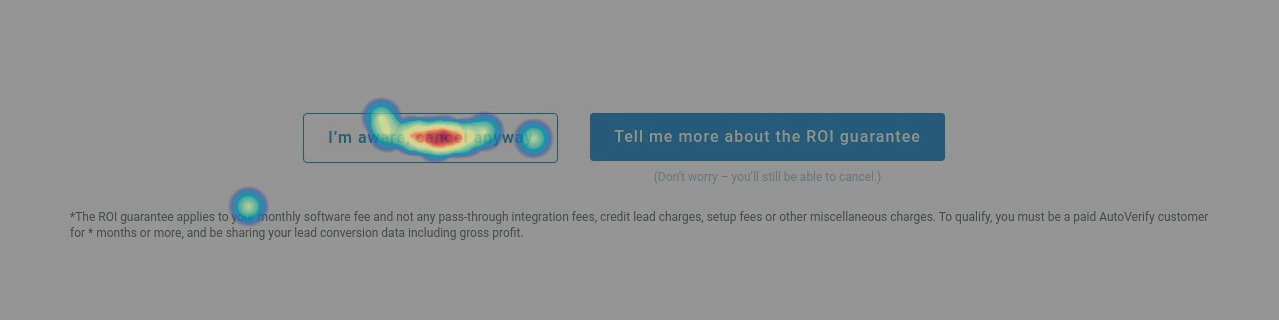
Click map of the CTAs at the start of our cancel flow
Context: What is the ROI guarantee?
The ROI guarantee is something offered to customers that want to cancel on the grounds that they don't believe they are making their money's worth with our tools. We pause their billing and retrain their team on lead handling, tool basics, etc. while also re-integrating our tools on their website. The idea is that we keep their bill at $0 until we can prove they are making at least 3X ROI (based on their regular monthly fee).
Research and Planning
After our initial kickoff meeting, I decided to run a simple usability test on the flow as it currently existed. Based on our discussions, my hypothesis was that there was a lack of understanding around what the ROI guarantee offers, and how it works.
I decided to run 2 simle user tests. My goals were both to gain a better understanding of how our users were navigating the existing cancel flow, and also to asses their understanding and interest in the ROI guarantee from both a sales and retention perspective.
Due to time constraints I opted not to use any screeners, but did segment testers based on our average customer (m/f aged 35-50).
Test #1
I wanted to run a general usability test of the cancel flow exactly as it currently exists to see if, while assessing the understanding of the ROI guarantee, I could also identify opportunities to improve the flow itself. The test gave a scenario outlining the current market, our tools, and our main audience. I then just had them interact with it as if they were looking to cancel their subscription, taking notes of their thought processes and any comments they made. At the end, I asked questions about the ROI guarantee.
Test #2
I was interested in seeing if there was a difference in understanding between our cancel flow and our sales materials, since Sales felt that the guarantee was a successful tool. I had testers review our sales material that outlined the guarantee from the perspective of new customers who had just signed up for our services.
I put most of the key takeaways directly in with the wireframes for easy access for stakeholders and so I could refrence them quickly while presenting design ideas.
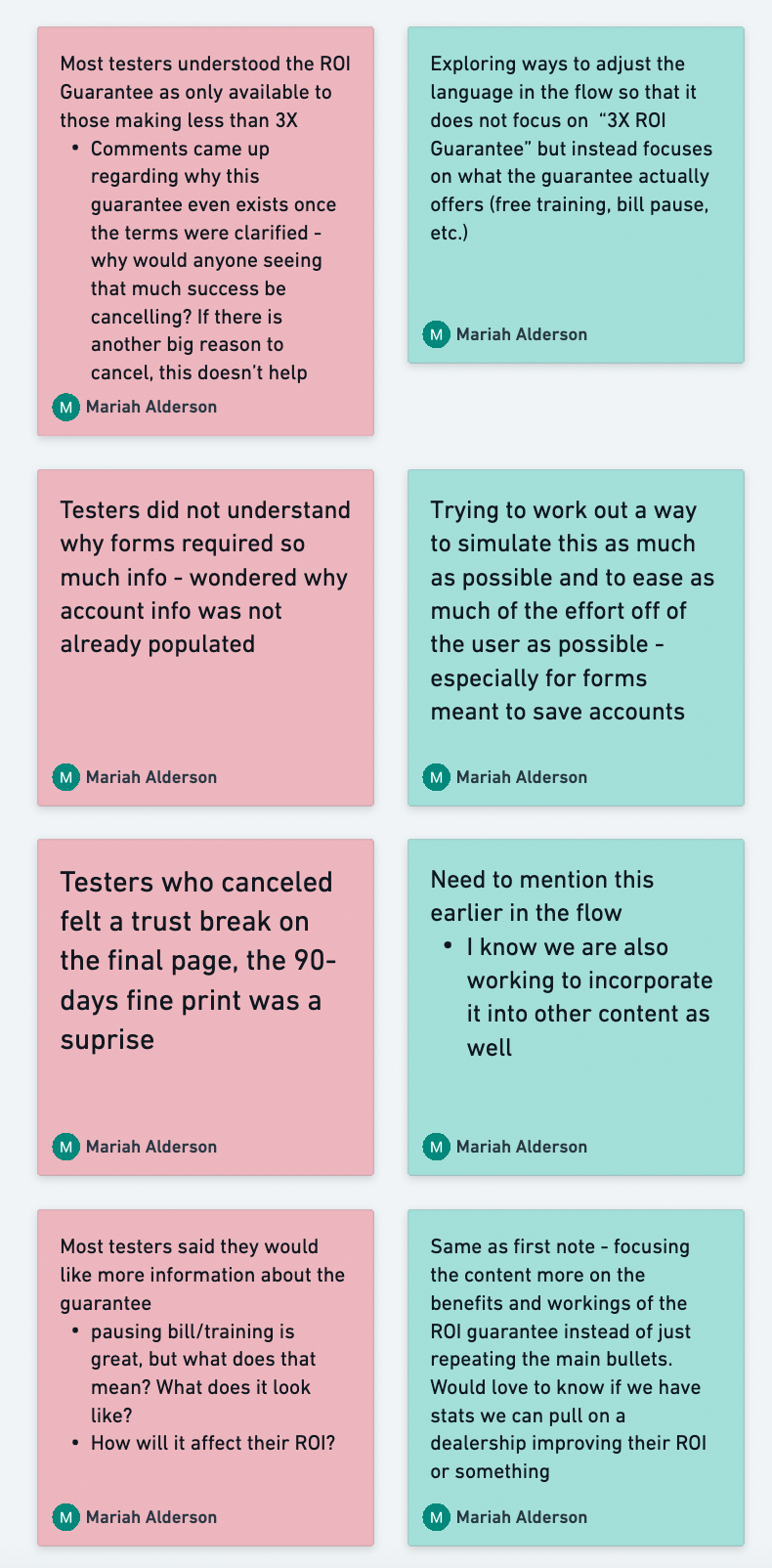
Putting my research findings directly into our working file made sharing the information easy
The ROI guarantee performed well in test #2 under a sales scenario, as the Sales team promised. However, as a retention tool in test #1, it performed very poorly.
👉 4 out of 5 testers opted to cancel and not invoke the guarantee
👉 1 tester was interested in the guarantee, but quickly abandoned it and cancelled instead after seeing a form requiring too much information
👉 3 out of 5 testers wanted more information about our free training
👉 0 testers answered correctly when asked to explain what the ROI guarantee offers and how it works
My takeaway from this research was that, as hypothesized, the ROI guarantee and what comes with it is not clear in the cancel flow. Nor are people interested in it. CS would like to use this information to get rid of it but leadership is pushing to keep it.
My solution here is both to add more information (as is present on the sales content that performed well), and to try changing the language and the presentation of information to focus on an immediate benefit to the user, rather than relying on the words "ROI guarantee".
Revamping our flow: From friction to helpful
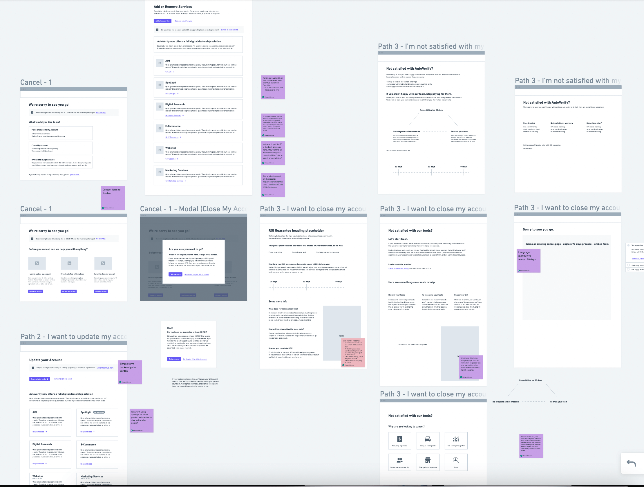
Now that I've done some research, I explored a few different options for building out the new flow. Through discussions with CS we decided together that we wanted to create a space called "Account Settings" that had multiple options for users to explore other than cancelling their account. That said, we wanted the option to cancel to be clear and easy to access.
The initial idea for the new landing page consisted of one landing page with a simple menu, directing users to different options.
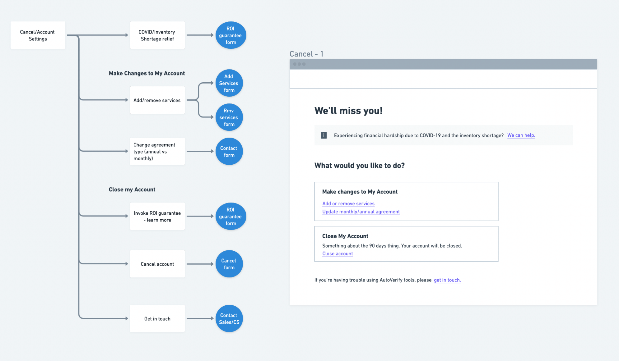
First iteration of the new flow
After reviewing examples from other companies with the team, I thought we could do a little better in trying to help to solve problems before the call to CS and suggested the idea of adding a "help" page. Since we pride ourselves on our expertise and our promise to help with free training, inserting helpful links and information could be useful here. This is also an opportunity for us to dive into the training and resources we offer, which was a common topic of interest amongst our testers.
I worked out a new flow sure to include these options:
👉 Update Account - here users can add/remove services and update their agreement from monthly to annual. Originally this was 2 separate links, but I opted to put them together on one page instead with hopes that they would be easier to find.
👉 "Live" objection handling - create a help page or blocker before cancel that lets customers select their issue, then provide them with a potential solution or direction to help. This will be based on our most common reasons for cancels, and hopefully, save CS some headache.
👉 Billing relief - with the automotive market in decline, highlight an option to request billing relief. This is mostly a direct link to CS, but important to have.
👉 Close account - right away we will inform the user of the 90-day cancellation time period, and instead of trying to redirect them like in the existing flow, I'll use a simple modal to offer our guarantee with new language that focuses on the benefits of the guarantee.
While the new flow looks much more complex than the original, it's actually somewhat simplified. The original flow would have required 6 pages, while the new one only requires 5, and still includes an extra page.
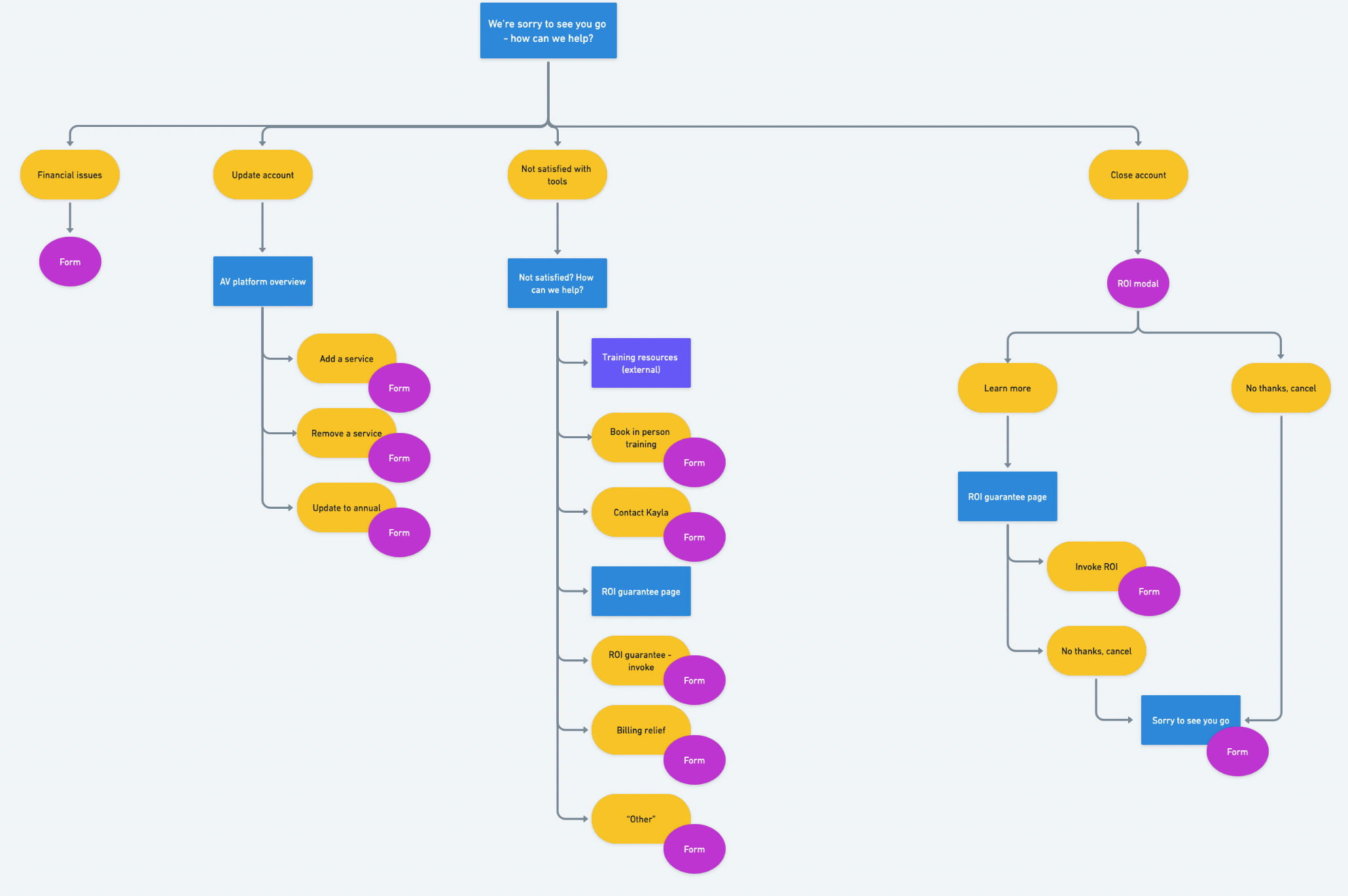
Final iteration of the new flow
Language updates
Once I had the flow figured out, it was time to update the language based on what I learned during the research phase. My goal with this was to be objective about the subject. The Sales team had previously led decisions on the content and it very heavily pressed on the ROI guarantee. Seeing that this was causing issues for the CS team due to the language being non-specific and somewhat confusing, my idea was to showcase what the offer actually includes without mentioning that it was our "very unique guarantee".
After drafting copy for the main parts of the flow, I met with our Content Manager to review, live edit, and discuss if what I had drafted was the best way to position our guarantee.
We ended up deciding to run a prefrence test. Since leadership was still pressing to keep the language around the guarantee as-is, even though we had already run a test that showed it was too difficult to understand, we thought it was best to have as much data as possible before presenting the designs.
I got a request to hide our branding while running the test, so I scrapped together a fake company and moved the content we decided on into Figma for the test. Below is an example of my new positioning, and the original language from the existing flow.
The test included the modals below, and the following page (after clicking the CTA) that explained the ROI guarantee in detail.
See the whole prototype here.
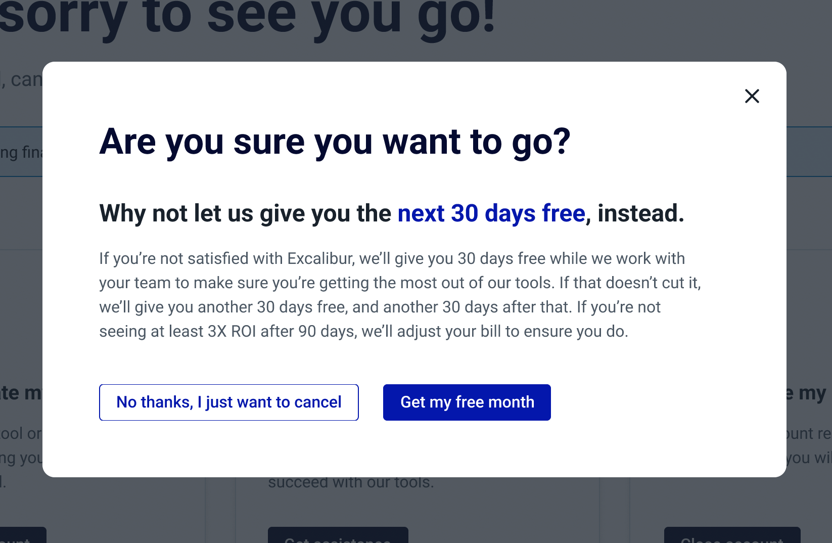
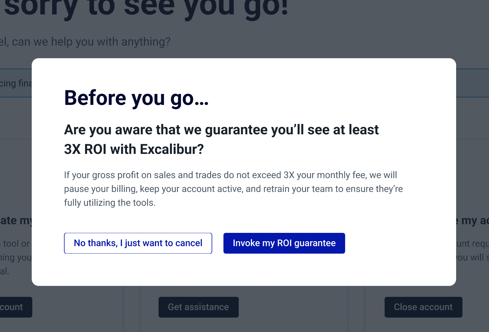
Examples of the different language I tested
The unexpected results
Our testers unanimously chose option B (original language). This surprised us after seeing such poor results with the same information in the tests we ran on the existing flow.
👉 Testers thought option B was more in-depth and liked the idea of being guaranteed they'll make 3X their gross profits with our tools better than just the idea of getting a month free.
👉 Although option B was the clear winner overall, testers found that the option to get 30 days free (option A CTA language) caught their attention more, even though the offer itself interested them less.
👉 Great improvement: After reading through each page, every tester was able to explain the ROI guarantee correctly!
The Final Designs
After receiving the results from the preference test, I had to go back to the drafted copy I did and make some adjustments. Based on the responses we got, it seems that the issue, rather than the language, was actually the presentation of information in our first test.
I ended up doing a hybrid of the new and old copy. CTAs and any text meant to be an attention-grabber I went with my language, and just went through and gave the original copy some simple refreshers to ensure the information was up-to-date.
Filling in the rest of the content
The biggest question mark in this project was definitely the ROI guarantee, but now that we had that figured out, we needed to write the rest of the content.
For the help page, we enlisted the help of one of our Account Managers. We spoke with her about her most common objections, most common reasons for cancel, and how she typically handles them. My manager and I compiled all of that info and I put it into the design for the page.
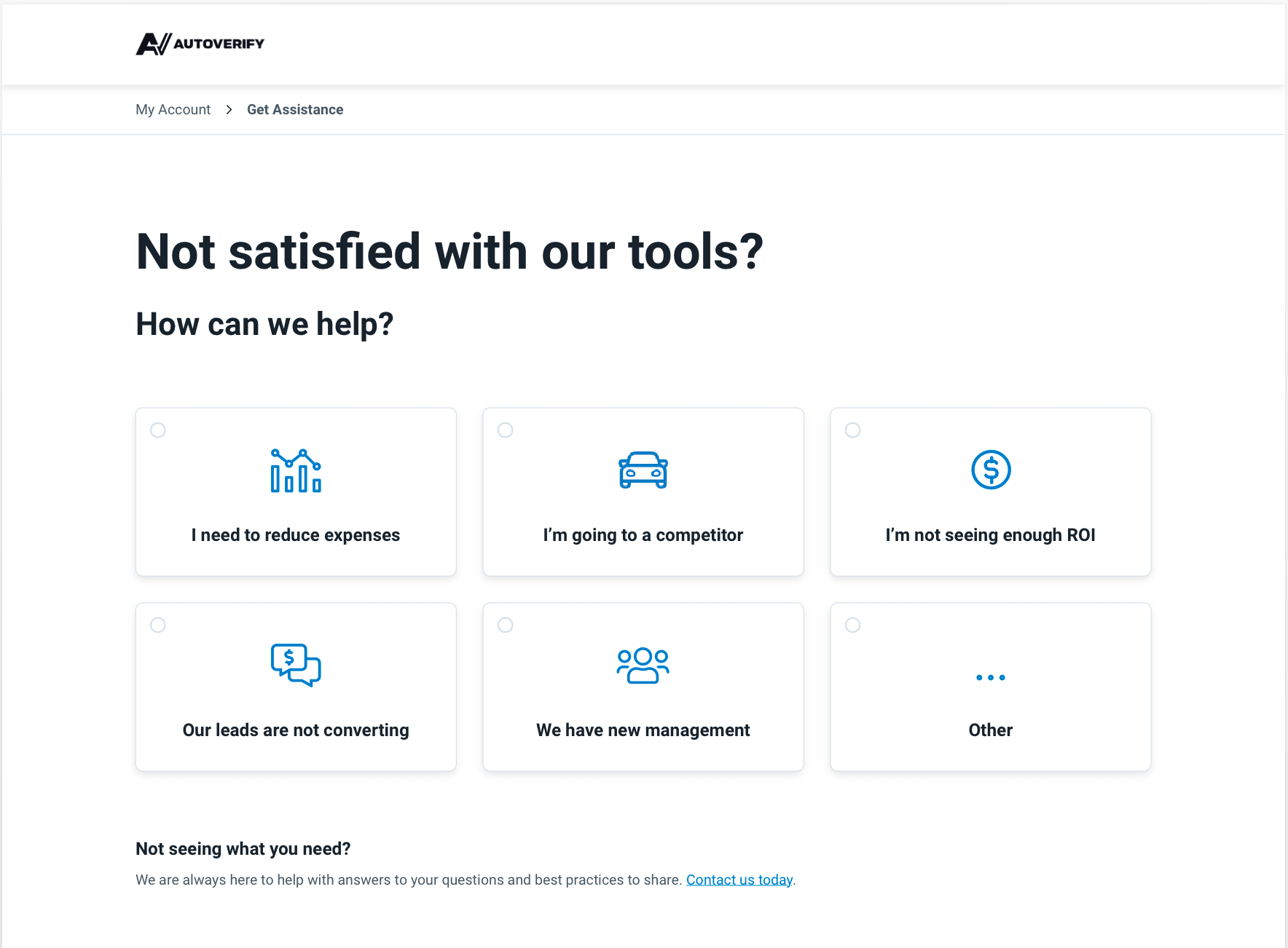
Our newly created help page
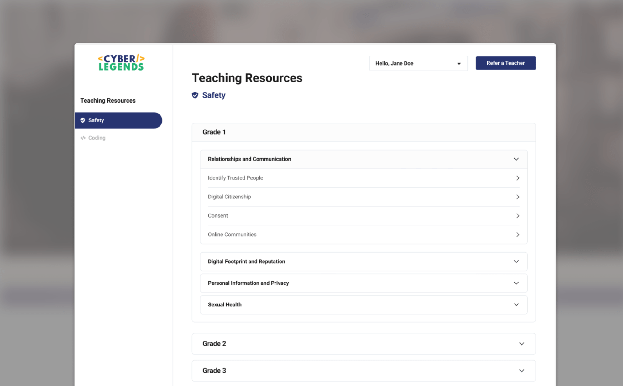
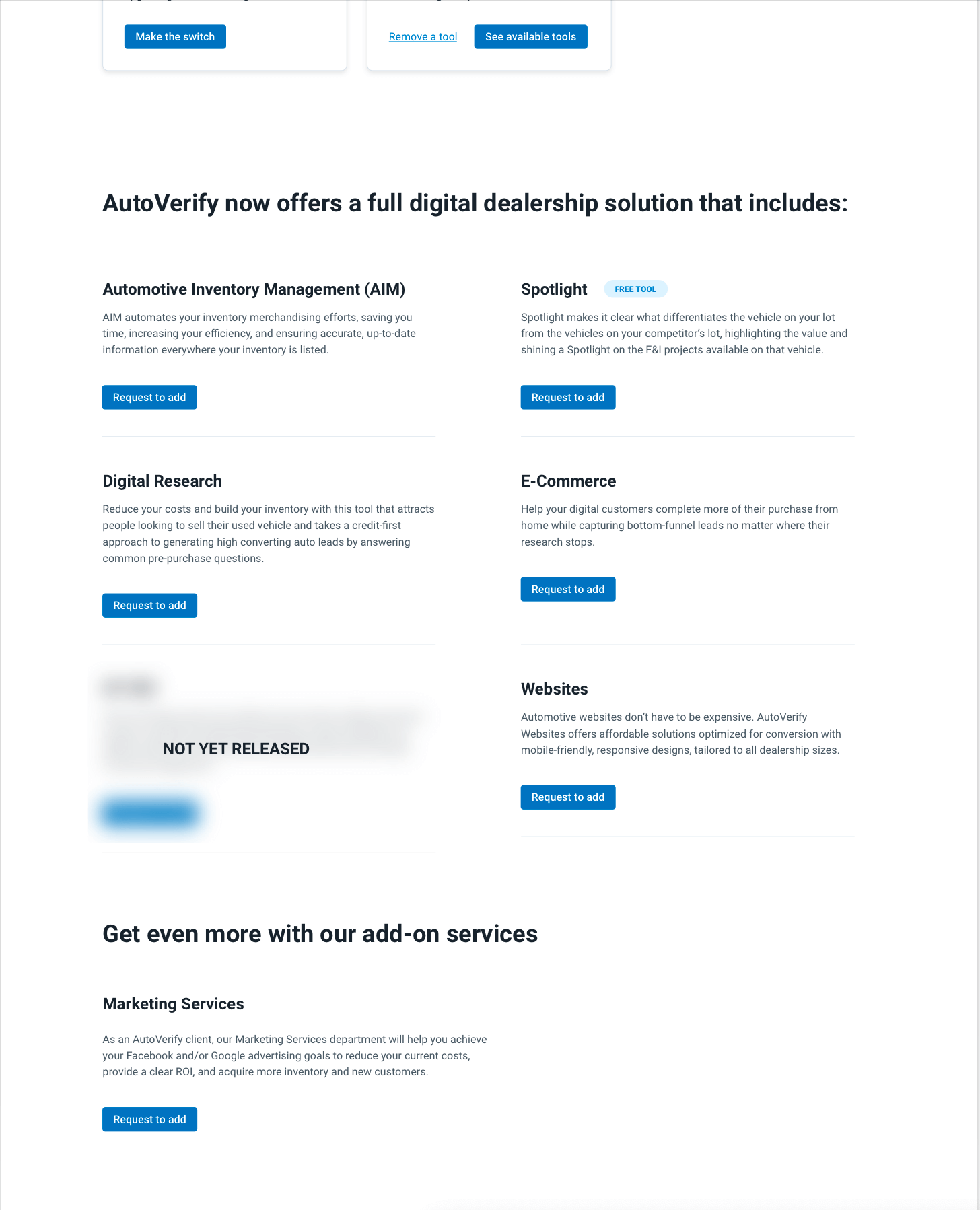
The other missing page was the Account Settings page, where users could switch to an annual agreement or add/remove products and services.
I decided to start the page with 2 card-style options that match the 3 used on the main Account page. This was the user has clear direction on what to use this page for, and can access each option easily. Switching to annual and removing a service will trigger a form, while the CTA to see available tools will scroll down the page to a list of products with an option to request to add for each.
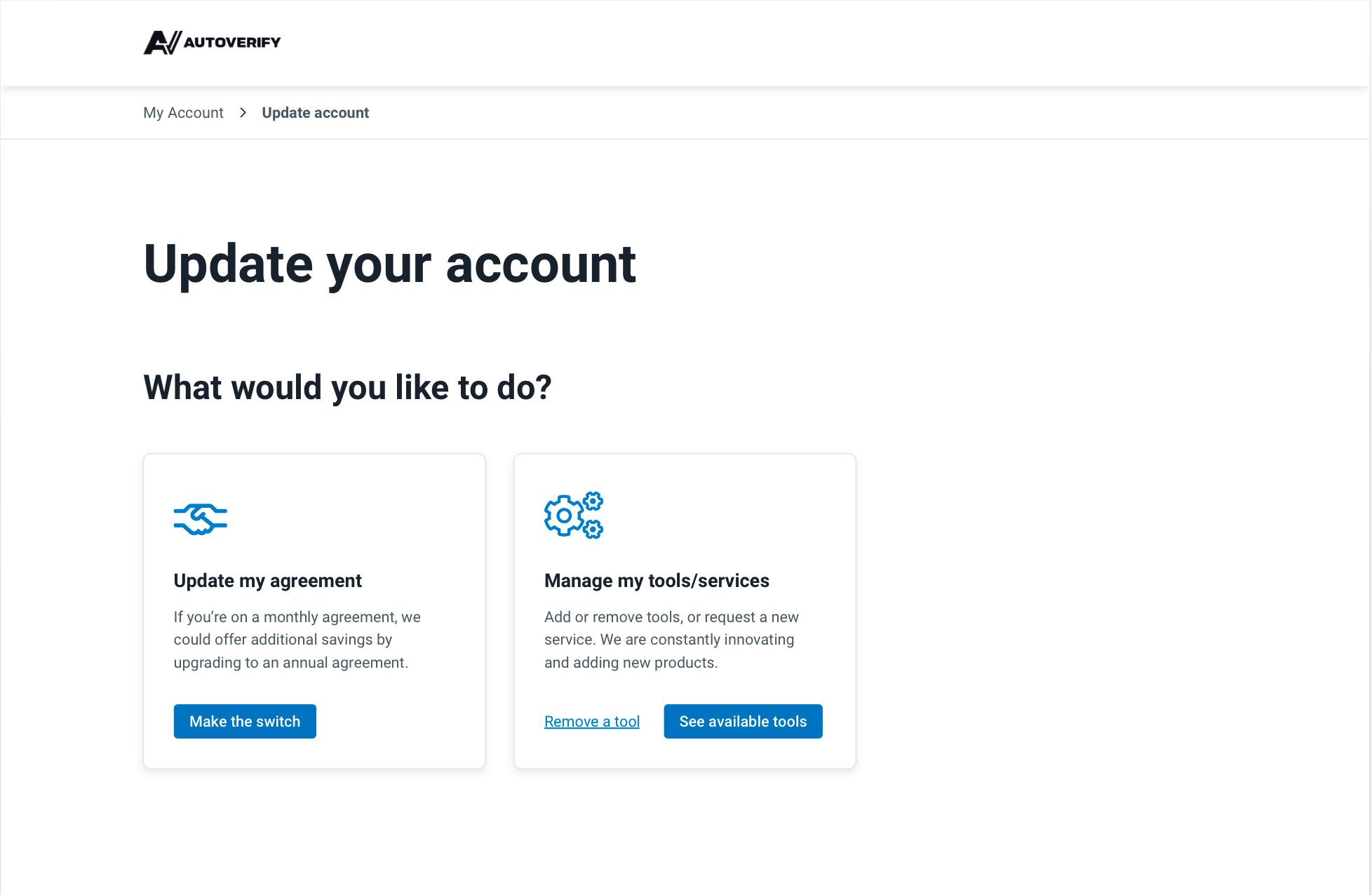
Above the fold on our newly created "Update Account" page
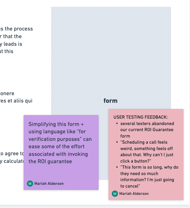
This page needed to address another issue brought up in our user testing: multiple long forms is deterring users from filling them in, especially since they are only on this page because they wish to cancel. If we want to potentially save any accounts here, we need to make the process as simple as possible.
That said, we have some technological limitations. As this is being built on Webflow with our main website, it is not able to be linked to our customers accounts. This means we can't pre-populate any information, including tools they do/don't have.
Our original sketch for this page included one form with many inputs. One input asking which product they are interested in, and then listing ~16 options. This is not likely to fly with our users.
Here is the solution I came up with:
👉 Create a separate form for each product. To the user, they will all be the same, but on the back-end, we can log which product they clicked on
👉 Simplify the forms.. A lot! I talked to Product and discovered that they have the option to add tools in their dashboard, also using a form. Their form only has 3 inputs. Let's use that one.
👉 Be super clear on why we need this information. We can't connect our users accounts, but we can do our best to simulate that as much as possible with this experience.
I wanted the design of the page itself to be simple and easy to follow. I decided on a 2 colum list with matching CTAs for each item. Each CTA will trigger the corresponding form.
Next Steps
This project was initially set to launch 1 month after we started, however, due to higher priority projects it has been pushed back. Therefore, this is an ongoing project. With the designs and content approved, I hope to be able to build it soon so we can measure it's success.
Read more case studies
Design Strategy Overhaul: Record-Breaking Leads from Market Research