Design Strategy Overhaul: Record-Breaking Leads from Market Research
Digital Marketing Efforts are Lacking Resources, and it Shows.
AutoVerify’s landing pages, social media ads, and email drip campaigns consistently underperform with minimal user engagement. Lack of resources and collaboration results in content that doesn’t align with the target audience's values or interests. Pushing for a research-first approach and fostering collaboration between teams led to 55% more leads from new landing pages, the first sales approved lead from a social media ad all year, and a fresh email design that brought in 4x the expected leads for the entire quarter in one morning.
AutoVerify is a SaaS startup that offers tools to help with the car buying process. This includes tools for car buyers tohelp them make informed decisions, and tools for car dealers to make the selling process easier.
Project Goals
Understand why marketing efforts are not bringing in results and create content that will hit lead goals.
My Role
Led research and design efforts with help from marketing content specialist for launch and writing edits.
Part 1: Taking a Step Back
Have we considered that our content is just not aligning?
The marketing department was at a crossroads. Efforts to bring in new leads were consistently failing, with social media ads not bringing in a single one for the entire year. Emails were also coming in at an extremely low success rate, and landing pages were seeing the same fate. It was now raising the question of whether or not budgets should be cut.
As the graphic designer, I usually wasn't involved in these bigger picture conversations. My job was mainly to take a brief, craft a design that matched it, and hand it back to be put out into the world. Now though, my work was coming into question. I didn't love that the content I was making wasn't bringing in results so I requested to sit in on the brainstorm.
The conversation seemed to be revolving around the use of keywords and my understanding was that this was always how it went. We launch a new campaign, we get no leads, we change the keywords, repeat. Clearly, this strategy wasn't working. So I pitched something else: Have we considered that reach is not the biggest issue? What if it's the content or the design itself that isn't resonating with our audiences?
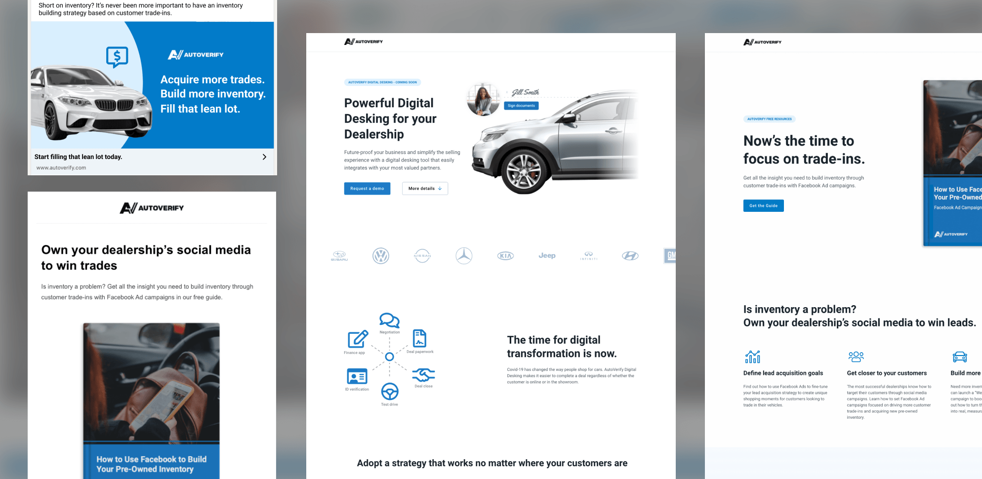
I was given the go ahead to take some time to explore the possibility of a content and design overhaul on our marketing content. I started with what was already available: public ads from our competitors.
.png)
Examples of ads pulled for my competitive analysis vs the current running AutoVerify ad
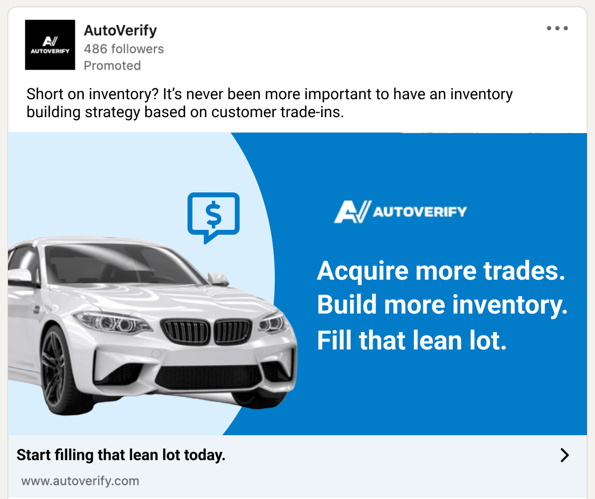
AutoVerify's ads had been the same for a long time. Designed simply, with images of cars and solid blue backgrounds with the goal of having a potential client click on it and book a demo. Compared to some competitors, this felt lacking. Here's what I found after conducting a competitive analysis:
👉 Most competitors ads were offering their audience something more immediate and useful than a demo
👉 Their lead capture forms were super simple and short, whereas ours had many fields
👉 Their language was helpful and relatable, while ours was focused on our products
👉 Their ads mostly used photographs, while ours were stylized, illustrative mockups
My takeaway from here was that we were not offering enough value to even peak the interest of our audience, much less convince them to fill in a lengthy form for little to nothing in return. We were positioning ourselves in our own best interest, not our audiences.
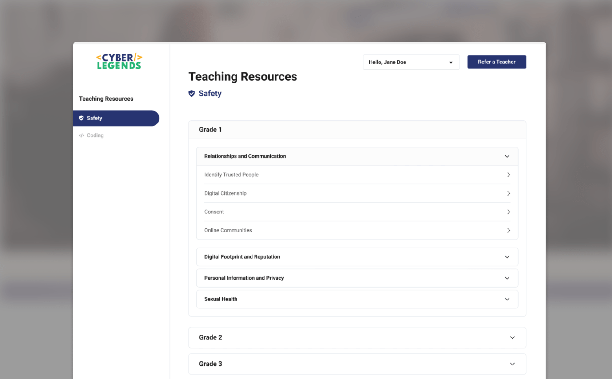
I wanted to take a look at our landing pages and see if the same rang true there. Analytics showed that when people did land on our pages, they didn't scroll at all and just abandoned the page a large majority of the time. When I took a closer look, I realized that all of the value we were offering existed below the fold, with only yet another lengthy form at the top of the page.

Heatmap of the latest running landing page showing minimal scrolling.
Part 2: Finding Value
Testing and collaborations
After making these discoveries I wanted to do two things: run some research on our ads and work with the product department to better understand the benefits of the software we were advertising, and how it helped to solve the pains of car dealers.
In being a small department with limited resources, I tapped on the product department for help with conducting research. We had access to Userbrain, an unmoderated usability testing platform with a little pile of credits that hadn't been used yet for the month. I graciously accepted access and began to work on figuring out how to run market research through a usability testing platform.
I ended up creating a fake Linkedin feed with our ad and a few competitors and sending it out for feelers on what resonated best and why. I wanted to know if people would click on any of them at all, which ones they would, and why they would decide to that. Results were looking great for our competitors, not great for us.
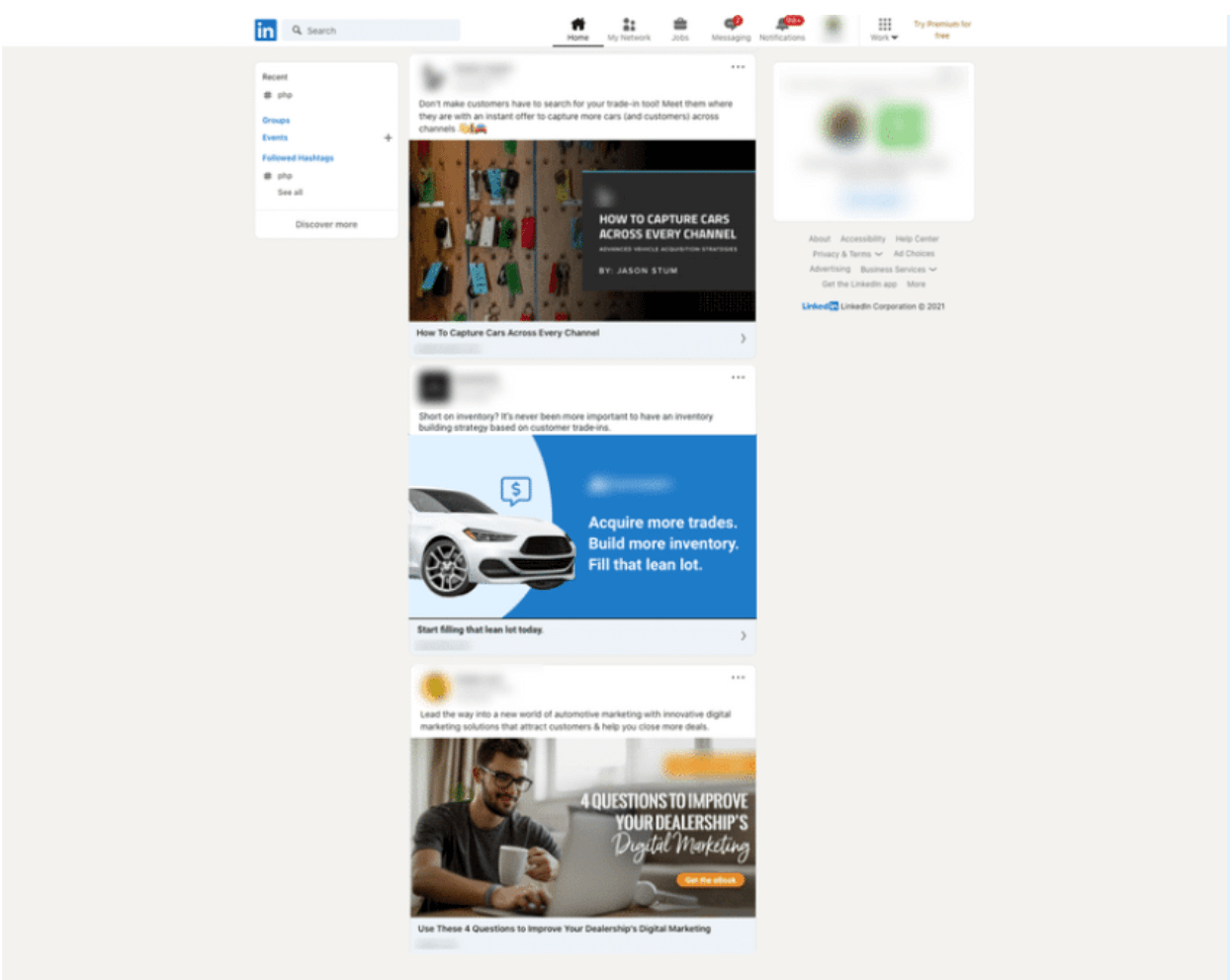
Screenshot of the fake linkedin feed used for the test
.png)
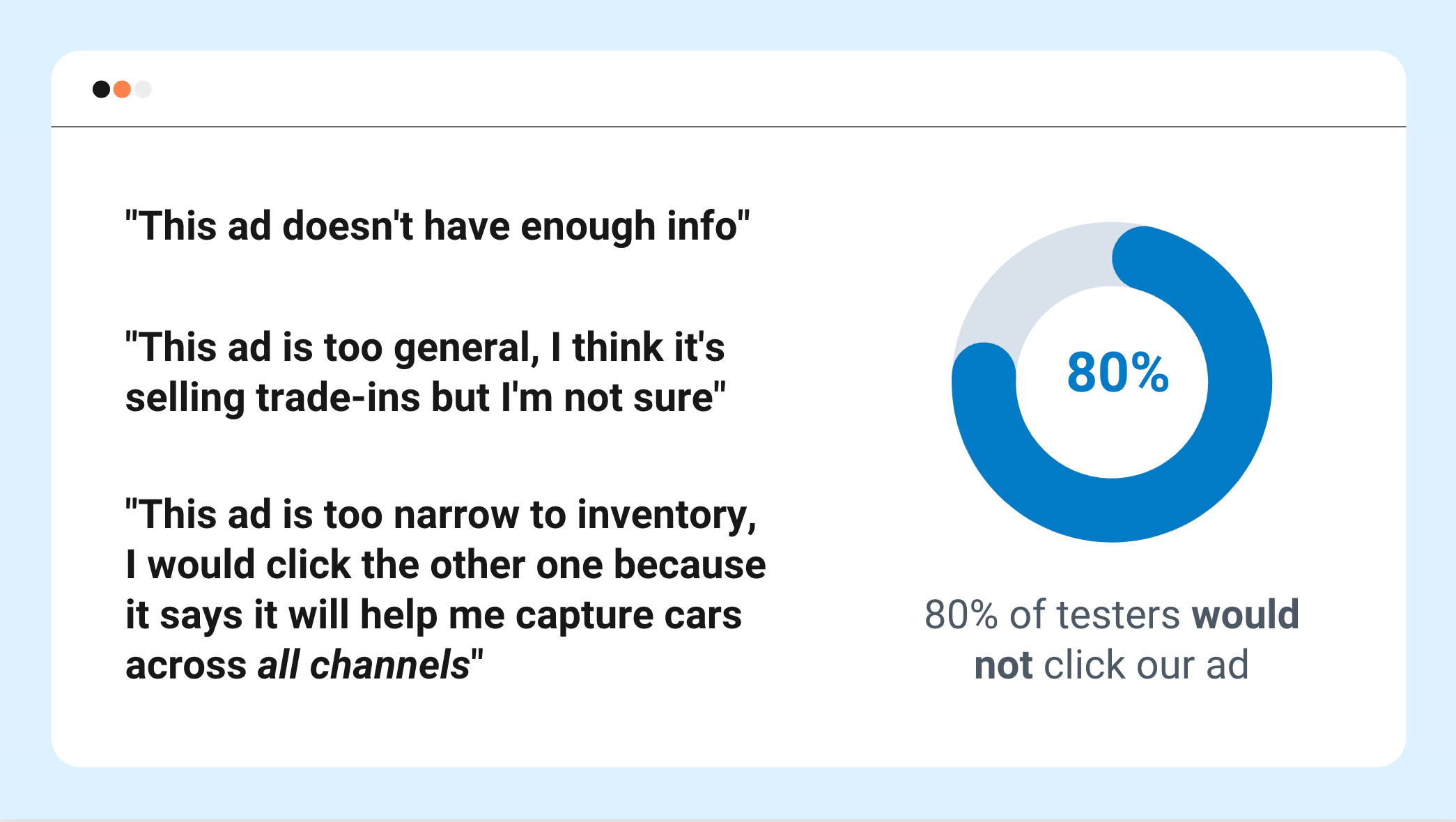
Screenshots from the test results share-out
The biggest takeaway from this research was that we needed to be offering something to our audience that could give them an immediate benefit like an ebook, and article, or some other kind of sharable information that they could use right away. If we wanted them to give us their information and learn about our products, we needed to prove to them that we deserved it.
My next step was to learn as much as I could about our newest product offering and exactly how it helped car dealers to do a better job than they could do without it. For this I partnered with the project manager for the new Desking product, and the designer responsible for it. If anyone was going to have an in-depth understanding of our users and their needs, I knew it was the product department.
Desking is the step in the car buying journey where the car buyer sits down and is presented options by the seller to come to an agreement on the selling price, monthly payment, and financing terms for the car purchase
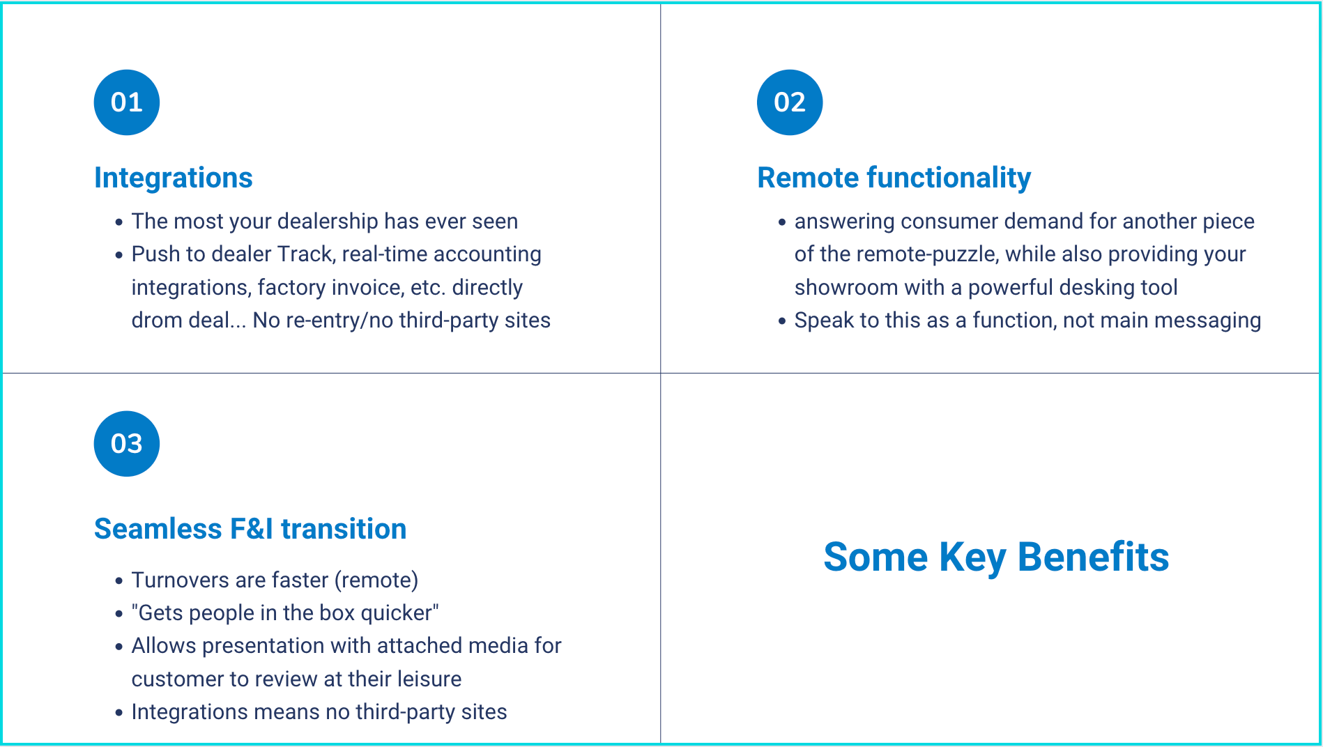
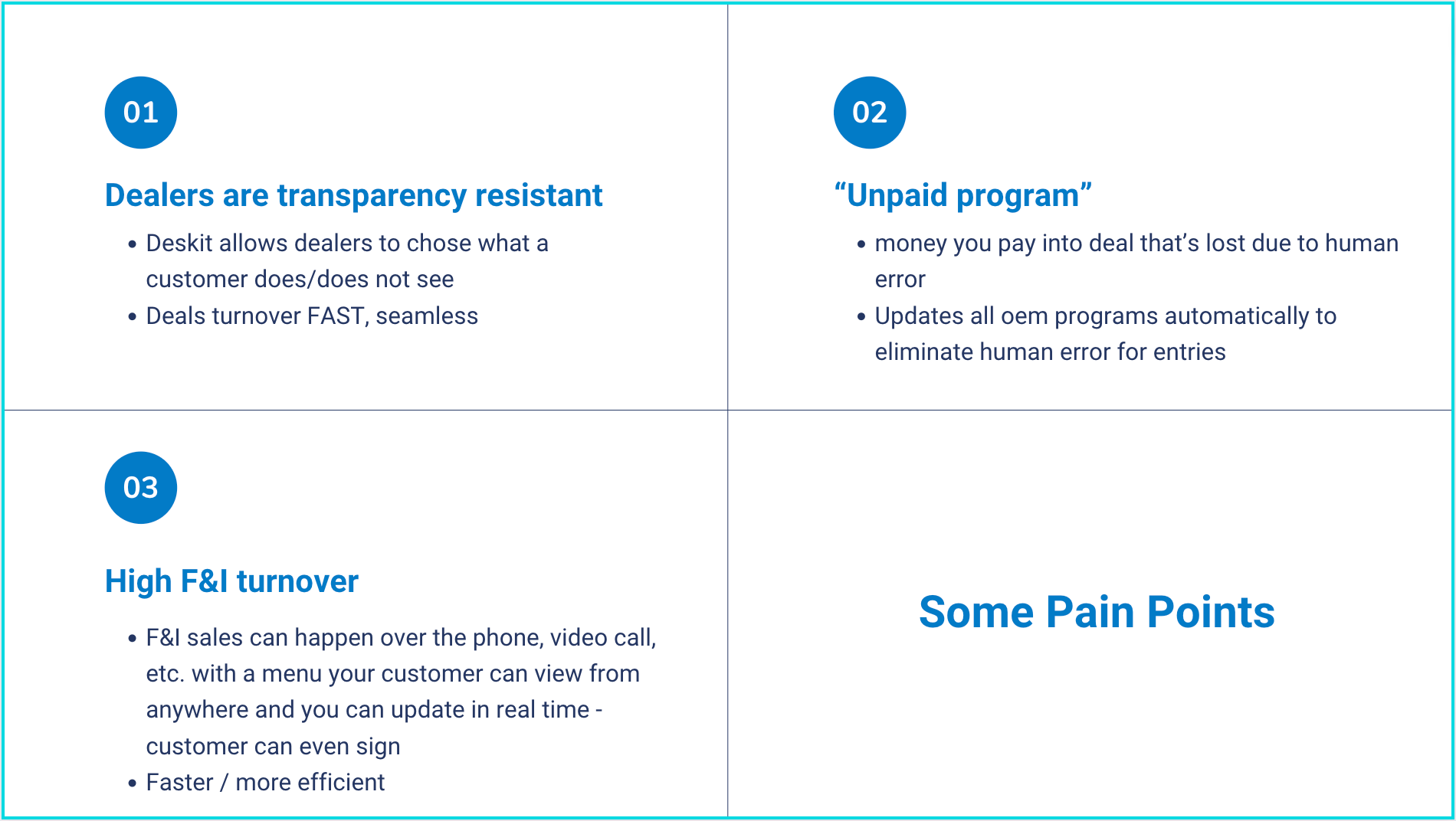
Pain points and key benefits taken from conversations with the product department
Part 3: Putting it Together
Designing a new landing page
Along with my internal research, I also did some reading into conversion-centered design. From this, I learned about structuring content on landing pages, better language to use, and best practices for implementation. A lot of it aligned with what I already learned: be clear about the value you provide.
Some ideas I had for implementing this:
👉 Add an interesting image to the hero section (replace the form, grab interest early)
👉 State the problem we are solving with our product (remind them why they need us)
👉 List the key benefits (not just listing features, but how do they actually benefit our clients)
👉 Include FAQ section (include extra info here, answer common questions)
👉 Build social proof (testimonials, client logos, etc. to build credibility)
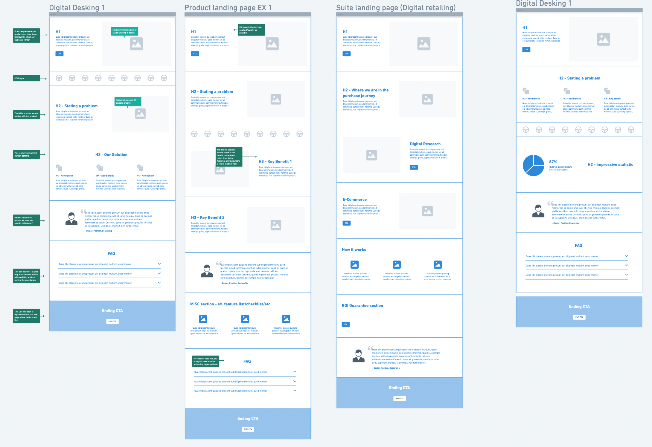
Annotated wireframes for new landing page designs that I shared with leadership
From here I worked with the content specialist as well as the Desking project manager to put together a landing page that would (hopefully) convert. We paired it with a new social media ad and ran the campaign. This redesign resulted in a whopping 5 leads! A huge improvement from our previous 0.
%20(1).png)
Launched Desking landing page that brought in 5x more leads than previous campaigns
Since a lot of the research also showed that we needed to offer immediate value, we worked out an ebook to send out in an email campaign to help dealers build their pre-owned inventory. This was a hot topic at the time, as it was during the pandemic when car dealerships were struggling with keeping up their inventory and were forced to focus on used cars to fill up their lots.
I wanted to keep the designs simple and scanable, while still showcasing enough value to peak the interest of our audience. I included plenty of social proof in the landing page with testimonials and stats relating to what the guide was teaching. In the email, I gave a summary of what you'll learn with bullet points in the shape of hand emojis (analytics showed that emails with emojis perform better).
%20(1).png)
%20(1).png)
Email (left) and landing page (right) designed to bring in leads by offering valuable content
The Final Results
With the new email, we surpassed our entire quartlerly lead goal in one morning.
All in all, this project resulted in:
👉 4x the average leads from email marketing
👉 100% increase in social ad conversions
👉 55% increae in landing page conversions
Since this research and design effort, more focus went into content creation in the form of guides and whitepapers. The new strategy stuck and ended up being used with similar results in all future campaigns.
Read More Case Studies
New Website Branding Brings a New Competitive Edge for Caseware